(English version below)
Hendrik Schevren (HS):
Das Bild versteh’ ich einfach nicht. Was soll das denn bedeuten?
Martin Knigge (MK):
Warum willst Du es denn sofort verstehen? Du hast es doch nur kurz angesehen.
HS: Ja, kurz, das reicht doch, dann hat man alles gesehen. Da seh‘ ich doch nur ein paar Farben, wohl mit Pinselstrichen aufgetragen, das ist alles.
MK: So, Du hast alles gesehen, aber es nicht verstanden, das hast Du doch gesagt. Das ist irgendwie ein Widerspruch, ein Problem zwischen beiden Aussagen. Du bist doch unzufrieden, weil Du wissen möchtest, welche Bedeutung das Bild hat, oder?
HS: Hat es denn überhaupt eine Bedeutung?
MK: Na klar, jede einzelne Farbe, die Ausdehnung der farbigen Flächen, die Gesamtkomposition, das ist kein Schnappschuss, sondern ein konzeptionelles, ein gestaltetes Bild.
HS: Sag‘ das doch einfach, erklär‘ das doch und dann bin ich schlauer.
MK: In solchen Fällen werd‘ ich, entschuldige, immer radikal und sage: Geh‘ doch weiter, bleib doch nicht vor meinem Bild stehen, guck dir was anderes an, wenn du dich damit nicht beschäftigen willst, geh‘ Kaffeetrinken oder so. Ich mach’ meine Bilder nicht für Leute, die sich nicht für sie interessieren.
HS: Reichlich elitäre Haltung hast Du da, finde ich.
MK: Nein, gar nicht, ich will den Leuten eben nicht das Nachdenken abnehmen, das aufmerksame Wahrnehmen, das sich Auseinandersetzen damit, durchaus auch das Spekulieren, falls sie sich mit meinen Bildern tatsächlich befassen wollen.
HS: Hm . . .
MK: Joseph Beuys hat doch ganz richtig gesagt, dass das Interpretieren eigentlich unkünstlerisch ist, zunächst jedenfalls. Man macht sonst gleich durch Zerreden das Bild kaputt. Später vielleicht, wenn man sich eine eigene Meinung gebildet hat, vielleicht auch nur ansatzweise, dann kann eine Interpretation hilfreich sein für das Verständnis eines Kunstwerks. Ich mach‘ meine Sachen ja immer in einem Kontext, oftmals in einem biographischen Kontext, also ich denk‘ mir nicht irgendwas aus, sondern verknüpfe vielleicht Erinnerungen damit oder versuche, ein ästhetisches Problem zu bewältigen oder zu lösen.
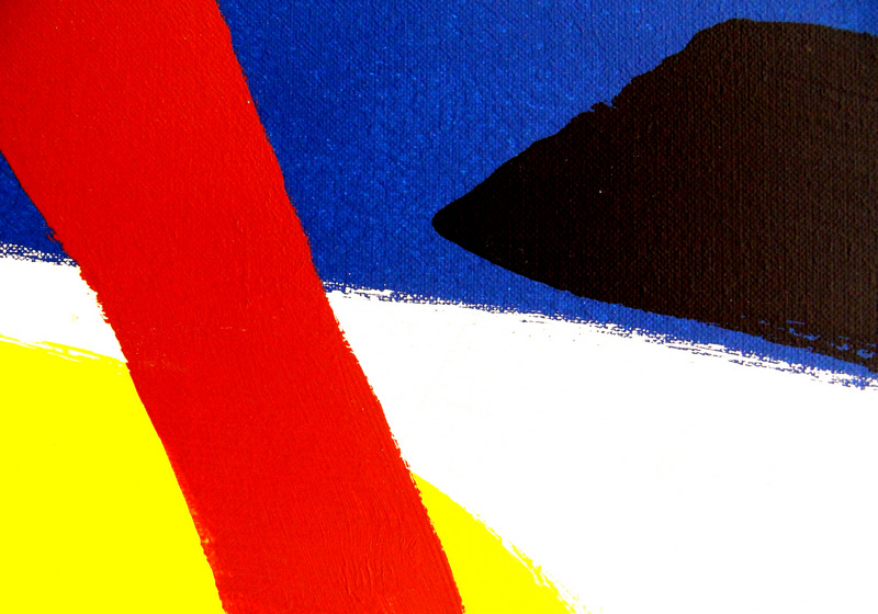
HS: Wir haben doch hier das Bild „rot-braun“, vielleicht kannst Du es daran ‘mal konkreter machen.
MK: Ja, sehr gut Dein Hinweis auf das Foto hier.
HS: Warum hast Du es denn „rot-braun“ betitelt? Man sieht ja weitere Farben wie blau, weiß, gelb.
MK: Die Bildbezeichnung zielt darauf ab, die Farben hervorzuheben, die entweder in der Erinnerung oder im Herstellungsprozess eine besondere Rolle gespielt haben. Ursprünglich wollte ich die Bilder sogar nur nummerieren, aber ich habe nie in Erwägung gezogen, Namen zu vergeben, die einen direkten Hinweis auf den Inhalt geben. Hier also beispielsweise „Landstück bei Bardowick“ oder „Ein Ferienerlebnis“, beide Bezeichnungen könnten darauf verweisen, worum es geht. Das Foto als materielles Subjekt zeigt zunächst doch selbst, welche Bedeutung es hat. Frank Stella brachte es für seine Gemälde ganz simpel auf den Punkt: Was man sieht, ist, was man sieht. Und die Antwort liegt zuerst und auch letztlich beim Betrachter. Er allein entscheidet über die ästhetische oder vielleicht auch emotionale Zuneigung oder Abneigung zum Bild. Der Bildgestalter hat grundsätzlich keinen Einfluss auf seine Entscheidung. Auf den ersten Blick, das gebe ich zu, ist die Ästhetik der Farbfläche widerständig, macht den Betrachter vielleicht ratlos. Das aber kann ein guter Anfang sein.
HS: Nun gut, dann spekuliere ich ‘mal ein bisschen.
MK: Nur zu …
HS: Sag‘ doch vorher noch, wie die Farbflächen entstehen, vielleicht hilft mir das etwas beim Spekulieren.
MK: Grob einteilen kann man die Bilder in Gemälde, Collagen, Objekte und Fotografien …
HS: Collagen?
MK: Ja, ein Beispiel ist die Farbfläche „schwarz-weiß“. Das Bild „rot-braun“, über das Du nachher sprechen möchtest, ist ein Ausschnitt aus einem Gemälde. Den größten Teil machen aber Fotografien aus, als Ausgangsbild, beispielsweise „dunkelgrün“ oder „schwarz-gelb“. Für die Fotografien verwende ich ein ganzes Arsenal von Techniken wie Unterbelichtung, Überbelichtung, Doppel- oder Mehrfachbelichtung, Unschärfe, verschiedenste Filter wie Glasscherben, transparente Plastikscheiben, Gelbfilter, Rotfilter, Verdunkelungsfilter und verschiedenste Objektive. Für ein endgültiges Foto brauche ich schon mal acht bis zehn Arbeitsgänge: Ein Ausgangsbild wird per Kamera kopiert, die gedruckte Kopie wird wiederum fotografiert und gedruckt und so weiter, und am Ende sind, hoffentlich wie erwartet, die Konturen weicher oder härter, die Farben diffuser oder klarer. Die letztgültige, finale Fotografie ist entstanden. Eine Farbfläche kann bezüglich ihrer Farben den letzten Schliff aber auch mittels des Druckers bekommen. Ein Bild ist ja erst fertig, wenn es gedruckt vorliegt. Und ein fertiges Bild ist wie eine Reinschrift aus Farbe und Form, so jedenfalls hat es ‘mal ein Künstler gesagt, dessen Namen mir eben nicht einfällt. Insgesamt gehe ich sehr handwerklich vor, was wohl auch mit meinem Herkommen von der analogen Fotografie und den entsprechend verwendeten Techniken zu tun hat.
HS: Ich seh’ da also rot, blau, braun, weiß und gelb, fünf Farben, die kreuz und quer durchs Bild gehen. Das Rot überdeckt blau, weiß und gelb, braun das Blau. Das Weiße ist wohl das Weiß der Leinwand. Man sieht das an den ausgefransten Rändern des Blau. Es dominiert auf jeden Fall der rote Streifen, der aus der Ecke links oben kommt, wobei der rechte Rand ungefähr unten in der Mitte endet. Würde man vom breiten blauen Farbstreifen den roten und den braunen wegnehmen können, dann würde das Blau die größte Fläche einnehmen. So ist aber sichtlich das Rot die ausgedehnteste Farbe.
MK: Erstaunlich …
HS: Die Farben symbolisieren ja üblicherweise, auch in Verbindung mit Blumen, menschliche Eigenschaften oder Körpersäfte wie rot für Blut oder gelb für Urin. Rot steht gemeinhin für Liebe und blau für Treue und Zuverlässigkeit, das Weiß für Reinheit, Keuschheit. Unsicher bin ich bei braun und gelb. Ich deute Dein Bild mal als Seelenzustand eines Menschen. Hast Du vielleicht Deinen eigenen, inneren Zustand abgebildet?
MK: Nein, weder meinen noch den eines anderen.
HS: Aber es würde gut in meinen Interpretationsansatz passen: Das heißblütige Rot, ein feuriger Charakter, unterdrückt sowohl die treue Mentalität und einen unschuldigen Charakter als auch ein gelbes Wesen, das sich nicht aus seiner Ecke traut. Und oben zielt ein wuchtig brauner Keil auf die rote Dominanz. Vielleicht spielen sich alle Gegensätzlichkeiten in einem Menschen ab. Oder es handelt sich um widerstreitende Individuen, jeweils durch eine Farbe dargestellt.
MK: Eine schöne und schlüssige Deutung, doch es handelt sich bei den Farben ganz einfach um die Wiedergabe einer Kindheitserinnerung an Naturgegebenheiten wie Mohnblumen, Raps, Wald, Weg und Wasser. Wir sollten im Kunstunterricht, ich war elf oder zwölf Jahre alt, irgendein Ferienerlebnis zeichnerisch-malerisch wiedergeben. Viele meiner Mitschüler und Mitschülerinnen malten Urlaubsbilder mit Eltern und Geschwistern am Meer oder im Gebirge. Ich dagegen gab wieder, was ich an einem sonnigen Tag auf einem Spaziergang erlebte. Von einem Jägerhochsitz betrachtete ich die Landschaft, sah die Ilmenau, den blauen Fluß meiner Heimatstadt Lüneburg, ein Feld mit Mohnblumen und eins mit Raps, in der Ferne einen Wald und unter mir einen Sandweg. Da ich aber keine einzelnen Blumen und Pflanzen sah, kaum einzelne Bäume und nur die Flächen des Flusses und des Weges, malte ich sie auch so, eben als farbige Flächen. Das allerdings gefiel meiner Lehrerin gar nicht, und ich musste ein neues, detailreiches Bild in Tusche malen. Danach nahm ich mir vor, nie wieder zu malen. Und auch deswegen kam ich später zur Fotografie.
HS: Das Bild hier ist aber offensichtlich nicht damals entstanden, und die Abbildung beruht doch auf einem gemalten Bild.
MK: Ja, die Fotografie zeigt einen Ausschnitt aus einem Gemälde, das die Erinnerung von damals wiedergeben soll.
HS: Schöne Geschichte. Allerdings kann einem Betrachter ohne Kenntnis des Kontextes, Dein Lieblingsbegriff, niemals eine Deinem Erlebnis entsprechende Interpretation gelingen.
MK: Richtig, aber das ist auch gar nicht nötig, denn man kann das Bild durchaus voraussetzungslos interpretieren, wie Du doch vorhin selbst gezeigt hast. Die Pluralität der Wahrnehmungen und Sichtweisen läßt die von mir gewollte Offenheit beziehungsweise eine offene Bedeutungsstruktur zu. Jeder soll doch das sehen oder empfinden oder interpretieren, was er will. Dem Bild, allen meinen Farbflächen, fehlt das offensichtlich Narrative, es wird nichts erzählt, es gibt für den Betrachter keine Anknüpfungspunkte in der Realität. Es gibt für ihn vielleicht aber einen Oberflächenreiz, denn das Bild ist “gesprächig”, wie Du doch bei “rot-braun” demonstriert hast. Auch für mich ist das zunächst ein Gang durch unbekanntes Gelände, wenn ich an einer Farbfläche arbeite, nämlich die Frage nach der bildlichen Umsetzung einer Idee. Grundsätzlich ist aber jedes Bild das Abbild irgendeiner Erfahrung.
HS: Wo ist eigentlich das originale Ölbild?
MK: Fast alle gemalten oder von mir gestalteten oder fotografierten Vorlagen werden nach der Ablichtung vernichtet. Was mir allerdings heftige Kritik einer von mir sehr geschätzten Künstlerin einbrachte.
HS: Hast Du Vorbilder?
MK: Ja, sowohl Bilder als visuelle Vorbilder als auch Fotografen, Maler, Bildhauer, die ich aber lieber als Anreger bezeichne.
HS: Auch Bildhauer?
MK: Carl Andre beispielsweise, ein amerikanischer Bildhauer und Pionier der Minimal Art. Seine Skulptur “Cataract” besteht aus flachen Stahlplatten, die, streng geometrisch auf dem Boden ausgelegt, ein einfaches, für mich sehr schönes Bild ergeben. Neulich las ich dazu in der Zeitung einen Satz über “minimalistische Kunst, wo es um Inhaltlosigkeit und Leere, um eine Entspannung des Blicks geht, weg von allem erzählerischen Ballast.” Wenn ich Bilder mache, passiert es fast automatisch, dass ich reduziere, um Formen freizulegen, die schon im Formenkumulus eines Objekts oder einer Abbildung enthalten sind. Es ist manchmal eine Art des Mikroskopierens, ja, Mikroskopieren des Unscheinbaren, der Ausdruck gefällt mir für einige meiner Arbeiten, das Sehen wie durch ein Mikroskop. Und, fällt mir eben ein, dem Maler Maik Wolf kann ich im Gesamtzusammenhang ganz und gar zustimmen, wenn er sagt, dass “nichts deprimierender ist als Bilder, die man nach zwei-, dreimal hinsehen verstanden hat.” Und, noch stärker, sagt er: “Vordergründigkeit ist das Ende von jedem Bild.”
HS: Deine Arbeit heißt ja Farbflächen, also Farbe auf Flächen.
MK: Es geht um Farben, die sich im Bild flächig ausbreiten. Diese Aussage ist ja an sich banal, doch ich berechne beziehungsweise kalkuliere vorher die Ausdehnung einer Farbe, die sich auf wenige Pixel Fläche beschränken oder fast das ganze Bild einnehmen kann. Wichtig ist mir in diesem Zusammenhang das, was Gotthard Graubner grundsätzlich über die Farbe sagte, nämlich dass sie “von jedem literarischen Inhalt befreit [ist], Rosa ist nicht Haut, Grün ist nicht Natur; Grau ist nicht Traurigkeit. Farbe besitzt eigenes Leben, eigene Sensibilität.” Weil Du nach Vorbildern fragtest: Neben Mark Rothko hat mich auch der Maler Graubner mit seinen Farbkörpern angeregt, über die Ausdehnung von Farben nachzudenken und mich in meinem Tun bestärkt, dass Farbe nicht an Gegenstände gebunden sein muß. Er beispielsweise trug diverse Farbschichten auf Leinwand, die über einen Körper aus synthetischer Watte gespannt wurde, deswegen Farbkörper, quadratisch oder rechteckig. Apropos Quadrat: Bedeutsam war beziehungsweise ist mir Josef Albers mit seinen Farb-Quadraten. Sol LeWitt sagte treffend über seine Arbeiten, was auch für mich wichtig ist, nämlich dass das Willkürliche, Launenhafte und Subjektive in der Kunst keinen Platz hat. Das Thema Farbe in Malerei und Fotografie ist also ein weites, kompliziertes Feld: psychologisch, philosophisch, technisch, naturwissenschaftlich.
HS: Du hast bisher vor allem von Malern gesprochen, aber noch gar nicht über Fotografen.
MK: Ja, stimmt. Die haben mich natürlich auch angeregt. Lucia Moholy beispielsweise, eine Fotografin des Bauhauses in den zwanziger Jahren des letzten Jahrhunderts mit ihren sachlichen Bildarbeiten. Sie lernte Heinrich Vogeler kennen, der später in Worpswede lebte und arbeitete. In Worpswede arbeitet auch Rüdiger Lubricht. In seinen schwarz-weißen Landschaftsbildern legt er Wert auf „Reduktion auf Form, Linien und Strukturen“, was auch in meinen Farbflächen eine gewisse Rolle spielt. Und von Worpswede, wo ich ja auch einige Jahre bildnerisch tätig war, ist es nicht weit nach Hamburg beziehungsweise zu zwei Hamburger Fotografinnen. Zum einen Dörte Eißfeldt, die auch Stipendiatin der Barkenhoff-Stiftung Worpswede war. Vor allem interessierten mich ihre frühen Schwarzweißfotografien, aufgenommen noch mit analogen Kameras. Wenn ich an sie denke, fällt mir immer die Frage meines Kunstprofessors ein, nachdem ich einen Schmalfilm zu einer Zwischenprüfung gezeigt hatte: „Sie sollten sich entscheiden, ob Sie filmender Fotograf oder fotografierender Filmer werden wollen.“ Mein Film über ein Freimarktgeschehen in Bremen war ihm zu statisch, die Möglichkeiten der Kamera seien nicht adäquat genutzt worden. Note folgerichtig nur „befriedigend“. Zum anderen Gisela Floto, die auch Filmerin ist, auch wie Eißfeldt mit ihren frühen Schwarzweißfotografien mit reduzierter Bildsprache. Bezogen auf mein Arbeiten ist auch eine bestimmte Werkgruppe von Thomas Demand, der Papier- und Pappmodelle von Räumen und Bauwerken herstellt, sie fotografiert und die Modelle dann zerstört und nur die Abbilder gelten läßt. Andere deutsche Fotografen und Fotografinnen wie beispielsweise Karl Blossfeldt, Bernd und Hilla Becher, Andreas Gursky oder Herlinde Koelbl haben mich vielleicht nicht direkt oder nur unbewußt beeinflußt. Das würde hier auch zu weit führen, darüber im Detail zu sprechen.
*) Das Interview mit Hendrik Schevren ist eine Zusammenfassung mehrerer Gespräche. Er möchte nicht seinen richtigen Namen nennen.
————————————————————————————————
CONVERSATION ABOUT COLOR AREAS
Hendrik Schevren (HS):
I just don’t get this picture. What’s it supposed to mean?
Martin Knigge (MK):
Why do you want to understand it straight away? You’ve only had a quick look at it.
HS: Yes, a quick look – that’s enough, isn’t it? Then you’ve seen it all. All I can see are a few colours, probably applied with brushstrokes – that’s all.
MK: So, you’ve seen it all, but you haven’t understood it – that’s what you said, isn’t it? That’s a bit of a contradiction, a problem between the two statements. You’re dissatisfied because you want to know what the picture means, aren’t you?
HS: Does it even have any meaning at all?
MK: Of course it does – every single colour, the extent of the coloured areas, the overall composition; this isn’t a snapshot, but a conceptual, a deliberately composed picture.
HS: Just say so, explain it to me, and then I’ll be none the wiser.
MK: In cases like this, I’m afraid I always get a bit radical and say: ‘Just move on, don’t stand there in front of my picture; have a look at something else if you don’t want to engage with it; go and have a coffee or something.’ I don’t make my pictures for people who aren’t interested in them.
HS: I think you’ve got quite an elitist attitude there.
MK: No, not at all; I simply don’t want to do the thinking for people, or take away their attentive observation, their engagement with the work – and certainly their speculation, too – if they actually want to engage with my pictures.
HS: Hmm . . .
MK: Joseph Beuys was quite right when he said that interpretation is actually unartistic – at least to begin with. Otherwise, you immediately ruin the picture by talking it to death. Later, perhaps, once you’ve formed your own opinion – even if only tentatively – then an interpretation can be helpful in understanding a work of art. I always create my work within a context, often a biographical one; so I don’t just make things up, but perhaps link memories to it or try to tackle or resolve an aesthetic problem.
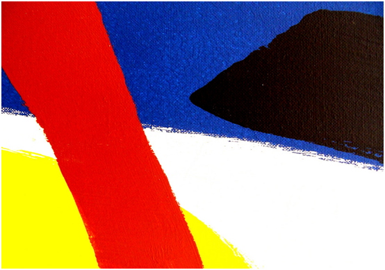
HS: We’ve got the picture ‘red-brown’ here – perhaps you could use that to make it a bit more concrete.
MK: Yes, that’s a very good point you’ve made about this photograph.
HS: Why did you title it ‘Red-Brown’? You can see other colours in it, such as blue, white and yellow.
MK: The titles of the pictures are intended to highlight the colours that played a special role either in my memory or during the creative process. Originally, I even wanted to simply number the pictures, but I never considered giving them titles that directly refer to their content. Take, for example, ‘A Patch of Land near Bardowick’ or ‘A Holiday Experience’ – both titles could hint at what the images are about. Yet the photograph, as a physical object, reveals its own meaning at first glance. Frank Stella put it very simply when discussing his paintings: what you see is what you see. And the answer lies first and foremost, and ultimately, with the viewer. They alone decide on their aesthetic – or perhaps even emotional – affinity with or aversion to the image. The artist has, in principle, no influence over this decision. At first glance, I admit, the aesthetics of the colour field are challenging; they might leave the viewer at a loss. But that can be a good starting point.
HS: Very well, then I’ll speculate a little.
MK: Go ahead …
HS: Why don’t you tell me first how the coloured surfaces are created? Perhaps that will help me a bit with my speculation.
MK: Broadly speaking, the works can be divided into paintings, collages, objects and photographs …
HS: Collages?
MK: Yes, one example is the colour field ‘black and white’. The image ‘red-brown’, which you’d like to talk about later, is a detail from a painting. However, the majority are photographs used as source images, such as ‘dark green’ or ‘black-yellow’. For the photographs, I use a whole arsenal of techniques such as underexposure, overexposure, double or multiple exposures, blurring, and a wide variety of filters such as shards of glass, transparent plastic discs, yellow filters, red filters, darkening filters and a wide variety of lenses. It can take as many as eight to ten steps to produce a final photograph: a source image is copied using a camera; the printed copy is then photographed and printed again, and so on; and in the end – hopefully as expected – the contours are softer or sharper, the colours more diffuse or clearer. The final, definitive photograph has been created. However, a coloured area can also receive its final touch in terms of colour via the printer. After all, a picture isn’t really finished until it’s been printed. And a finished picture is like a fair copy of colour and form – at least, that’s what an artist once said, though I can’t quite recall his name at the moment. Overall, I take a very craft-based approach, which probably also has to do with my background in analogue photography and the techniques I use as a result.
HS: So I can see red, blue, brown, white and yellow – five colours criss-crossing the picture. The red covers the blue, white and yellow, and the brown covers the blue. The white is presumably the white of the canvas. You can see this from the frayed edges of the blue. The red stripe coming from the top-left corner certainly dominates, whilst its right-hand edge ends roughly in the middle at the bottom. If one could remove the red and brown from the broad blue stripe, then the blue would cover the largest area. As it is, however, the red is clearly the most extensive colour.
MK: Astonishing …
HS: Colours usually symbolise human characteristics or bodily fluids – even in connection with flowers – such as red for blood or yellow for urine. Red generally stands for love and blue for loyalty and reliability, whilst white stands for purity and chastity. I’m not quite sure about brown and yellow. I’ll interpret your picture as a person’s state of mind. Have you perhaps depicted your own inner state?
MK: No, neither my own nor anyone else’s.
HS: But it would fit well with my interpretative approach: the passionate red, a fiery character, suppresses both the loyal mindset and an innocent character, as well as a yellow being that doesn’t dare to venture out of its corner. And at the top, a powerful brown wedge challenges the dominance of red. Perhaps all these contrasts play out within a single person. Or perhaps they represent conflicting individuals, each represented by a colour.
MK: A lovely and coherent interpretation, but the colours are quite simply a depiction of a childhood memory of natural scenes such as poppies, rapeseed fields, woods, paths and water. In art class – I was eleven or twelve years old – we were asked to depict a holiday experience through drawing or painting. Many of my classmates painted holiday scenes with their parents and siblings by the sea or in the mountains. I, on the other hand, depicted what I had experienced on a walk one sunny day. From a hunter’s raised hide, I looked out over the landscape: I could see the Ilmenau, the blue river of my home town of Lüneburg; a field of poppies and one of rapeseed; a forest in the distance; and a sandy path below me. However, as I couldn’t make out individual flowers or plants, barely any individual trees, and could only see the expanses of the river and the path, I painted them as such – simply as coloured areas. My teacher, however, didn’t like that at all, and I had to paint a new, detailed picture in ink. After that, I resolved never to paint again. And that’s also why I turned to photography later on.
HS: But this picture was obviously not taken back then, and the image is based on a painted picture, isn’t it?
MK: Yes, the photograph shows a detail from a painting intended to capture the memory of that time.
HS: A lovely story. However, a viewer without any knowledge of the context – your favourite term – will never be able to arrive at an interpretation that matches your experience.
MK: True, but that isn’t necessary at all, because one can certainly interpret the picture without any preconceptions, as you yourself demonstrated earlier. The plurality of perceptions and perspectives allows for the openness – or rather, an open structure of meaning – that I intended. Everyone should be free to see, feel or interpret whatever they wish. The picture – all my areas of colour – clearly lacks any narrative; it doesn’t tell a story, and there are no points of reference in reality for the viewer. However, there may be a surface appeal for them, as the painting is ‘conversational’, as you demonstrated with ‘red-brown’. For me, too, working on a colour field is initially a journey through unfamiliar territory – namely, the question of how to translate an idea into a visual form. Fundamentally, though, every painting is the reflection of some experience.
HS: Where, actually, is the original oil painting?
MK: Almost all the originals I’ve painted, designed or photographed are destroyed after they’ve been photographed. This did, however, earn me fierce criticism from an artist I hold in very high regard.
HS: Do you have any role models?
MK: Yes, both pictures as visual role models and photographers, painters and sculptors – though I prefer to describe them as sources of inspiration.
HS: Sculptors too?
MK: Carl Andre, for example, an American sculptor and pioneer of Minimal Art. His sculpture “Cataract” consists of flat steel plates which, laid out on the floor in a strictly geometric pattern, create a simple image that I find very beautiful. I recently read a sentence in the newspaper about “minimalist art, which is about a lack of content and emptiness, about allowing the eye to relax, away from all narrative ballast.” When I create images, it happens almost automatically that I reduce elements in order to reveal forms that are already contained within the accumulation of forms in an object or an image. It’s sometimes a kind of microscopic examination – yes, examining the inconspicuous under a microscope; I like that expression for some of my works – seeing as if through a microscope. And, it just occurs to me, I can wholeheartedly agree with the painter Maik Wolf in the broader context when he says that ‘nothing is more depressing than pictures that you’ve understood after looking at them two or three times.’ And, even more strongly, he says: ‘Superficiality is the end of every picture.’
HS: Your work is called ‘Colour Fields’, that is, colour on surfaces.
MK: It’s about colours that spread out across the picture as flat areas. This statement is, of course, banal in itself, but I work out or calculate in advance the extent of a colour, which may be confined to a few pixels or take up almost the entire picture. What is important to me in this context is what Gotthard Graubner said fundamentally about colour, namely that it is ‘freed from any literary content; pink is not skin, green is not nature; grey is not sadness. Colour possesses a life of its own, a sensitivity of its own.” Since you asked about influences: alongside Mark Rothko, the painter Graubner, with his ‘colour bodies’, also inspired me to reflect on the extent of colours and reinforced my belief that colour need not be bound to objects. He, for example, applied various layers of paint to canvas stretched over a frame made of synthetic wadding—hence ‘colour bodies’—which were square or rectangular. Speaking of squares: Josef Albers, with his colour squares, was – and remains – significant to me. Sol LeWitt aptly said of his work something that is also important to me, namely that the arbitrary, the capricious and the subjective have no place in art. The subject of colour in painting and photography is therefore a vast, complex field: psychological, philosophical, technical and scientific.
HS: So far you’ve mainly been talking about painters, but you haven’t mentioned photographers at all.
MK: Yes, that’s true. They’ve certainly inspired me too, of course. Lucia Moholy, for example, a Bauhaus photographer in the 1920s, with her objective photographic works. She met Heinrich Vogeler, who later lived and worked in Worpswede. Rüdiger Lubricht also works in Worpswede. In his black-and-white landscape photographs, he emphasises ‘reduction to form, lines and structures’, which also plays a certain role in my areas of colour. And from Worpswede – where I was also active as an artist for several years – it’s not far to Hamburg, or rather to two female photographers based in Hamburg. Firstly, there is Dörte Eißfeldt, who was also a scholarship holder of the Barkenhoff Foundation in Worpswede. I was particularly interested in her early black-and-white photographs, taken using analogue cameras. Whenever I think of her, I’m always reminded of the question my art professor asked me after I’d shown a short film for a mid-term exam: ‘You should decide whether you want to be a photographer who makes films or a filmmaker who takes photographs.’ He found my film about a street market in Bremen too static; he felt the camera’s potential hadn’t been utilised properly. Consequently, my mark was merely ‘satisfactory’. Then there is Gisela Floto, who is also a filmmaker; like Eißfeldt, her early black-and-white photographs feature a minimalist visual language. In relation to my own work, there is also a specific body of work by Thomas Demand, who creates paper and cardboard models of rooms and buildings, photographs them, and then destroys the models, leaving only the images to stand on their own. Other German photographers, such as Karl Blossfeldt, Bernd and Hilla Becher, Andreas Gursky or Herlinde Koelbl, may not have influenced me directly, or perhaps only subconsciously. It would take us too far afield to discuss this in detail here.
*) The interview with Hendrik Schevren is a summary of several conversations. He does not wish to give his real name.